

Data Science, Machine Learning, and BI are buzz words these days. It is a specialized profile and requires blended knowledge of Mathematics, programming, and database. And with the advent of technology, we have multiple options available for data analytics and visualization. But most of these tools come at a high cost and require time to get hang of it.
Not all of us can become data scientists because not all of us aspired to be one.
In an organization, only a handful of people work in such specialized roles. In contrast, most of the population performs some form of analysis and present their findings and recommendations. And their primary tool for this is Excel.
So, how capable Excel is in comparison to more advanced tools like Power BI or Tableau?
Any data analysis process goes through the following stages:
Extract, transform and compile data
Data modeling
Summarizing and visualizing data
Share & publish results
Let us evaluate how useful Excel can be in these aspects.
Extract, Transform & Compile
With Office 2013, Microsoft introduced Power Query, an ETL (Extract, Transform, Load) tool in Excel. It is a blend of Excel formulas and VBA codes, but super easy to learn and implement.

The modern Excel can connect to multiple data sources which include other Excel files, CSV, SQL servers, SQL Server Analysis Services, websites, and more:


What can we do with Power Query? We can:
Compile data from various (Copy-paste job)
Filter unwanted rows and columns
Combine multiple tables with a few mouse clicks (VLOOKUP)
Add categories & additional calculated columns
In any analysis, most of the time and effort goes into data cleaning and transformations. Power Query does all the heavy lifting. We can automate the entire data ETL process, and that too without writing a single line of code.
You may refer to the following articles:
Power Query offers no code/low code capabilities for cleaning up data, and it does not have the limitation for the number of records, as Excel has. In other words, Power Query is capable of handling data tables with over a million rows.
Additionally, we can use Flash Fill for data transformation and that too without applying any formula
Data Modelling
Power Pivot
Along with the Power Query, Excel got its data modeling feature: Power Pivot. It is like the regular pivot table in excel but on steroids. We can perform some advanced data modeling capabilities like working with relational tables and writing complex business logic using DAX.
DAX, also known as Data Analytics eXpressions, is the formula language of the Tabular model of SQL Server Analysis Services, Power BI and Power Pivot. For more details, please refer to the following article:
Just like the Power Query, the restriction of million rows in Excel does not apply here. So, I can connect with multiple data sources, and I can do some advanced data modeling using Power Query and Power Pivot.
In a nutshell:

You may refer to the following article on getting started with Power Pivot:
Since, Power Query and DAX are the building blocks of Power BI, learning and practicing them in Excel has an added advantage.
Data Analytics
A typical BI or data analysis process has the following stages:

Using pivot, Power Pivot, and native Excel formulas, we can easily do the descriptive and diagnostic analytics, but what about predictive and prescriptive?
The answer is: Analysis Tool pack & Solver Add-in

Analysis ToolPak has most of the statistical tests including ANOVA, Linear Regression

The Solver is suitable to run “what-if” scenarios. It can solve complex scenarios with multiple constraints within seconds using different solver algorithms.

A separate article will cover this in detail.
Along with this, Excel has an inbuilt Forecast sheet, which we can use for Time Series forecasting.
Summarizing & Visualizing Data
This one is straightforward. We all have been using MS Excel for this purpose for a long time now. For summarizing, the pivot table has been the obvious choice as it has the capability of performing multiple calculations without writing any formulas. You may refer to the following articles on pivot tables:
When combined with the data modeling capabilities of Power Pivot, we can build robust business models.
Apart from pivots, Microsoft 365 has introduced Ideas. It is a mix of machine learning and artificial intelligence capabilities in Excel. Refer to the following article on Ideas:
Data Visualization
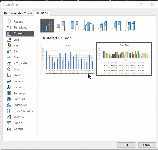
Graphs in Excel has evolved with time. Along with the regular bar, column & pie charts, Excel has included statistical charts like histogram, box plots, Pareto charts. A few alternative visualizations like a waterfall, treemap, sunburst, and funnel charts, make it a comprehensive package.
I have worked on Power BI, Tableau, Python, R. The ease of customizing a graph in Excel is way ahead than any of these tools.
Share & Publish Reports
How easy is it to share a report or dashboard prepared on Excel? I don’t think we need an article for this point. Excel spreadsheets are easily the most common way of sharing data and insights. It is still the most convenient way to create dashboards and share them with a broader audience.
The best thing about Excel is that it is super easy to work & learn. There are a plethora of learning materials available online and easy to do the knowledge transfer.
If it is not big data, Excel is an excellent tool to master the concepts of analytics and visualization. It may lack the level of interactivity, but it still a worthy contender and the first choice for a budding data enthusiast.