
QuickBytes is a series of articles for simple and easy to implement techniques with exponential benefits

Power BI desktop has the capability of sharing a quick analysis of any significant fluctuation in the data.
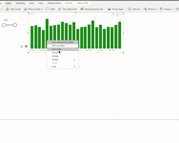
Let us consider the following example:

There is a significant increase in the value from April to May 2011. We can quickly analyze the possible factors using Insights.

It presents the difference in the form of multiple visuals and dimensions, along with summarized findings.
Please note that this output considers only the difference from the immediate previous point (bar or column) and not the entire period in the visual.
Using Insights
Right-click on May 2011 > Analyze > Explain the Increase

Power BI runs the machine learning algorithms over the data table and presents various factors that have a significant contribution towards the increase or decrease.

The thumbs up and thumbs down buttons are to provide the feedback for the visual and the feature. It provides feedback about the feature; however, it does not train the algorithm to update the result for the next run.
The plus sign adds the selected visual to the report. We can then format the visual as per the requirement.

There are four types of visuals for each insight: waterfall, scatter plot, 100% stacked column chart & ribbon chart.

The default chart is a waterfall chart.
Visuals in Insights
Waterfall Chart
The waterfall chart offers a comprehensive view of the change from the previous period to the next.

Scatter Plot
The scatter plot presents another exciting aspect. The x-axis represents the first period, whereas the y-axis the second period.

Data points in the green region are with positive movement, and the data points in the red region represent a decrease in value.
The dotted line is the best fit line. Data points with an increase higher than the overall trend are above this line, and vice versa.
Ribbon Chart
Ribbon chart helps show before and after stages:

Stacked Bar Chart
And the stacked bar chart helps in showing the proportion of 100%, and allows side by side comparison:

For calculation logic and limitations, please refer to the following article:
Telling a story: Insights with Bookmarks
We can use Insights to gather points and creating visuals about the factors which brought significant change. Then using bookmarks and selection pane, we can tell a story:
Download the pbix file here
Following article explains how to use bookmarks and selection panes and use Power BI desktop for presenting a story:
PS: Finding insights works best with the flat files (no related or normalized tables) and calculated columns instead of measures.